About this Project
Years ago, the client team had two different applications for datacenter network management, one focusing on transport and the other on storage. When the two applications merged, the resultant application ended up with six different visualizations of the network topology.
We were tasked to simplify the six topologies. I worked as the UX designer, responsible for simplifying the topologies, while my teammate supported me in visual design.
Challenges
Though it was clear that six network topologies is too many, it wasn’t clear how many topologies the application ought to have. Each topology offered a specific slice of the configuration information.
How many topologies should there be?
How do we present the various layers of information without overwhelming the user?
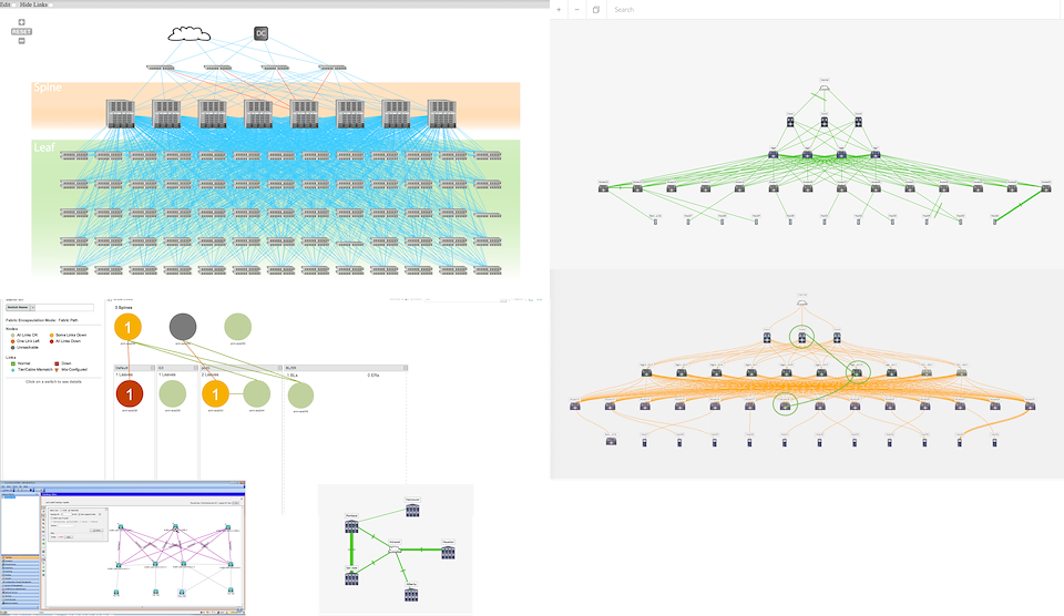
Figure 1 – Six different network topologies, each showing a different type of information, or the same information in a different way.
Insights
We spent a lot of time pouring over the six different topologies to learn about the information behind each of them. Eventually, we recognized that in order to really prevent user confusion, there can only be one topology.
With the popularity of network virtualization, the virtual network is the best platform on which to build other layers of information.
Result
Given the ubiquity of virtualization technology, we selected the virtual network to the default topology. We organized the devices hierarchically, with the most operationally critical devices at the top.
Most enterprise networks have hundreds if not thousands of devices. The filtering options are displayed in plain sight, so that the user can discover both what is shown and what is hidden. Down (broken) links are an exception, though, as it is important to point out errors to the user rather than make them look for it.
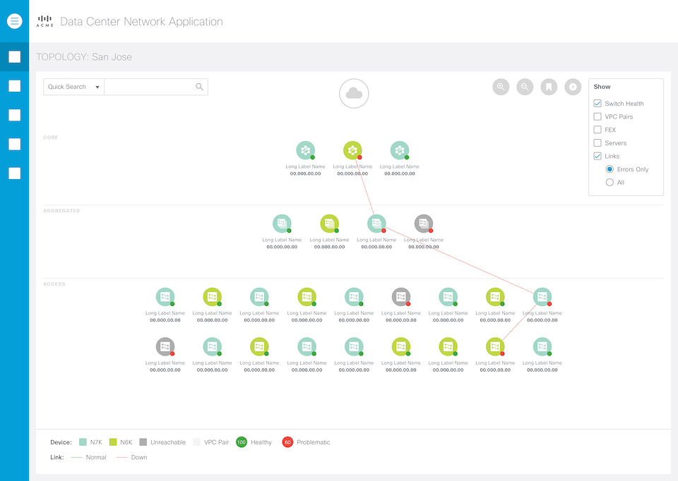
Figure 2 – The default view of the topology, with only the primary information (device health and down links) shown.
Secondary configuration data include Virtual Port Channel (VPC) and Fabric Extenders (FEX). These configuration data are not critical to the topology, but can be extremely useful in troubleshooting scenarios. Both of these configurations can be turned on via the Filter Pane on the upper right hand corner.
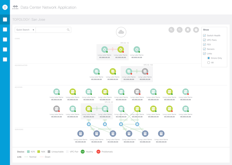
Figure 3 – With VPC, FEX, and Servers configuration information turned on. Notice the extra boxes and notations.
Rarely do users go look at the topology just for fun – it’s either to confirm a configuration edit or to troubleshoot a problem.
For the latter use case, the user must be able to drill-down to a selected device or link to look at its performance data. The troubleshooting use case is neither precise nor deterministic. The user often digs around shallowly for a while before drilling down deep.
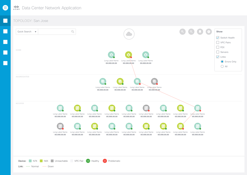
Figure 4 – Animated sequence showing the drill-down of a device, from pop-over to side pane.
We designed similar interactions for the links.

Figure 5 – Animated sequence showing the drill-down of links. Note that it’s very similar to that of devices.
Another important configuration to show is the custom tagging. Users can tag any number of devices with any tags they want. These tags can be used to group devices in the same building location, for example. It’s an important organization feature for the users.
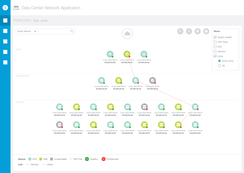
Figure 6 – Turning on the tagging option allows the user to see the available tags and which devices have that tag.
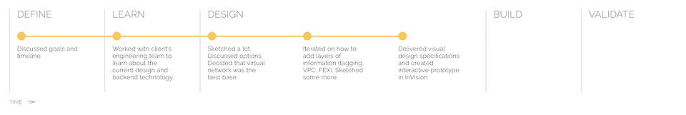
Process
The following illustrates the process the I went through for this project:
Beyond this Project
We worked very closely with both the client’s backend engineering and frontend development for this project. We feel that the design satisfies the use cases well. We did not have time to redesign the entire datacenter application. While the topology will stand out from the rest of the application from a visual and UX design point of view, the transitions are smooth and logical.